
Landing page
Hollow Creek Farmstead
Rustic e-commerce landing page for a full-ecosystem family farm selling fresh produce, pasture-raised meats, and farm supplies. Warm earthy design with CSA subscriptions, product showcases, and a conversion-focused layout rooted in authentic farm storytelling.
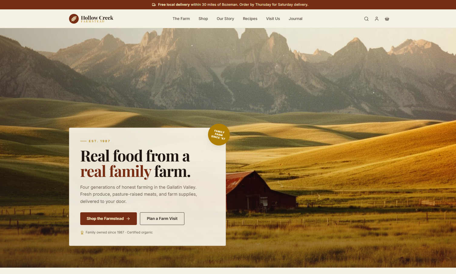
A working farm website that actually feels like a working farm. Visitors move through three clear buyer paths: fresh produce, pasture-raised meat and eggs, and farm supplies. Designed to convert both home cooks looking for real food and homesteaders looking for trusted tools.
Highlights
- Full-width cinematic hero with farm imagery
- Three-pillar category grid (Produce, Meat, Supplies)
- Seasonal featured products showcase
- Farm story section with generational stats
- Four-step farm-to-door process timeline
- Livestock showcase with breed information
- Agricultural supplies section with bullet features
- CSA subscription tiers with weekly share options
- Vintage-style testimonial cards with wheat icons
- Farm journal and recipe blog previews
- Visit the farm section with address and hours
- Instagram feed grid
- Newsletter signup with rustic styling
- Certifications badge row in footer
- Mobile-first responsive layout