
Clearer Shopify shipping and returns for Canada and US shoppers
Lessons from my Cleanflow work: organise country-specific answers, keep policy wording consistent and check product messages on mobile.
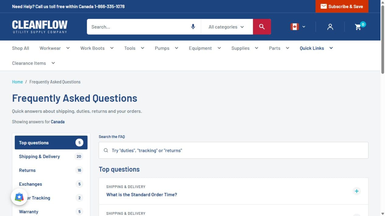
A store serving Canada and the United States needs more than a country selector. Shoppers need clear answers about their order, and those answers need to agree wherever they find them.
During my October 2026 work for Cleanflow, a Canadian utility supply company, I worked on the FAQ, policy pages, product messages, contact page and mobile storefront. This guide explains the approach behind that work. It is about presenting a merchant’s approved policies clearly; the merchant still decides the actual shipping and returns terms.
Start with every place a promise appears
Shipping information rarely lives on one page. It can appear beside a product price, in a footer, inside an FAQ, in a policy page and in the order confirmation email.
Before changing copy, list those places. For each one, record which country it serves, where its wording comes from and who approves a change. A useful working checklist is:
- Order processing time and what it means.
- Delivery estimates and any stated exceptions.
- Shipping charges and free-shipping eligibility.
- Freight items and mixed orders.
- How a customer starts a return or exchange.
- The contact route for an unresolved question.
At Cleanflow, I aligned approved shipping information across six shipping pages, seven product pages and the order confirmation email. The useful outcome was consistent wording across those surfaces. I am not claiming that this alone increased sales.
Give shoppers answers for the selected market
A single long FAQ can make customers read through rules that do not apply to their order. I built Cleanflow’s FAQ with country-specific answers for Canada and the US, topic navigation, search and a short list of top questions.
Keep the current country visible. A shopper should be able to tell why they are seeing an answer, especially after following a shared link. Test the page again after switching countries instead of assuming that a correct first load covers both markets.
Keep returns and exchanges distinct when the steps differ. People asking for another size should not have to guess whether a refund process is also the exchange process.
Make the full policy easy to scan
Short product messages are useful, but they cannot carry every condition. They should lead to the relevant full policy.
For Cleanflow, I built a shared responsive layout and applied it to eight policy pages. The layout used clear sections, contents links and help blocks. On pages with existing forms or FAQ markup, the work preserved those functions while changing the presentation.
When reviewing a policy page, read it on a phone. Can you find the process, the exceptions and the next action without moving through an uninterrupted wall of text? Keep the important conditions next to the promise they qualify.
Test the exceptions beside the product price
A shipping message must remain correct when a customer changes a variant. For Cleanflow’s free-shipping label, I handled freight eligibility rather than showing the same message on every product.
Build a small test set before release:
- A normal product that qualifies for the message.
- A freight product that must not show it.
- A product with both eligible and ineligible variants.
- A sold-out item.
- An item that requires a quotation instead of a normal purchase.
Use the same thinking for payment icons and purchase messages. I excluded quote-only and sold-out/contact-only states from the payment-icon treatment where it did not fit the purchase path.
Review the mobile page as a whole
A correct message can still be difficult to use if a chat greeting covers the product title or a sticky purchase bar contains meaningless text.
My Cleanflow work included suppressing the automatic chat greeting on phones and tablets while keeping the chat launcher available. I also removed “Title: Default Title” from the mobile sticky bar for default-only variants, preserving meaningful variant information and the purchase action.
These were specific interface changes. Measuring their effect requires a separate review of customer behaviour and enquiries.
Keep the release small enough to check
Back up the theme, agree the wording, preview the changes and verify both markets before publishing. Keep a record of what went live and what remains a proposal. A feature built in a preview is not automatically a live storefront feature.
The Cleanflow case study shows the delivered scope. If your store has accumulated conflicting messages across pages and templates, my Shopify development and store management service can start with that inventory and a focused first batch of fixes.